Have you seen photos which you think has more feel to it than it should? A certain rough-ness that isn't usual at all in 2D images? One possible reason for this would be texture. A bit of post prod - I use Photoshop - and viola! You have one truly enhanced image.
I'm posting this step-by-step for me, too. I learned it mostly on my own, with a bit of learning picked up here and there, and with the encouragement of a contact in Flickr, Pedro.
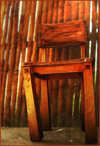
I started out with this picture of a chair.
 Which I opened with Microsoft Office Picture Manager. I find that the easier to use when all I need to do is some cropping or rotating. That's exactly what I did, and came up with
 I saved this and opened it using Photoshop CS2. Decided to create a Depth of Field to bring that chair out of the bamboo-work.
Afterwhich, I toggled a bit with the "create a new fill or adjustment layer" option. Played with hue and saturation, contrast and curves. Came up with something I thought would be nice to play textures with.
I'm adding this note so I can remember how to do this. If you know a better way, please leave a comment so I learn the easier/better way, too.
How to Add Texture to Photos:
1. Open image in PS.
2. Search for texture in folder.
3. Drag texture into PS window.
4. Click on the texture.
5. Click Layer > Duplicate Layer > image title.
6. Click image. Drag Fill and Opacity until you're satisfied with outcome.
My first texture:

* Add another texture, if you want to.
I added this:

I used two on as you sit, both of which I made on my own. I'm starting my own compilation of textures you may use. IF YOU DO, I'd like to be credited for the texture in your image and a link to the collection so others can share it, too.
After using the texture, I played some more with hue, saturation, contrasts, curves and photo filter. (All of which you will find in the "create a new fill or adjustment layer" option at the bottom right of your PS screen.)
I also toyed with lighting. It can be found from the top tool bar: Filter > Render > Lighting. For this one I used 2pm light with ambience a bit heavy on the positive end of the scale.
After this, I put on a frame for the image plus my watermark. I came up with this:
When I posted it on my Flickr page, I searched for quotes from thinkexist and came up with one Dian Ross gem. Added that to my posting and viola! as you sit was born.
Comments, suggestions and tutorials are most welcome as comments. I'd love to know more about how to optimize the use of Photoshop and so your contribution towards my learning is most appreciated.
Whew! Never thought I'd post something like this after a few weeks of using Photoshop. It seemed all too technical for me when I started this journey. Which ofcourse is my way of saying... even if you're a beginner with some reluctance in using complicated software like PS, it is possible to overcome that reluctance bit by bit and learn a new language in the process. =)


2 comments:
wow, this is great! I love that you do a tutorial for it. It's a great way for us wannabe's to learn! Keep it going!
nice to see you dropped by. =)
Post a Comment